
Logo design and website design for translator Victoria Barrera.
Originally from Argentina, Victoria Barrera specializes in translations for Latin America. I have learned in this project that European Spanish and Latin American Spanish can be quite different (and within the Latin American countries as well, and it’s a little unusual for a translator located in Europe to focus on Latin American Spanish. So this was one element to emphasize, the next challenge was to merge two very different focus groups in one visual design: Finance and Economy with their serious and more conservative expectations contrast with Human Resources and Journalism, which one would usually approach with a warmer and less distant solution.
My first step was to find a font made by a South American type designer. Keep it local, in a manner of speaking. We landed on Igna Sans by Daniel Peralta (Latinotype). It’s subtly curved letters have a little latin temperament without loosing a classic feel, which perfectly combines this two-pronged approach.
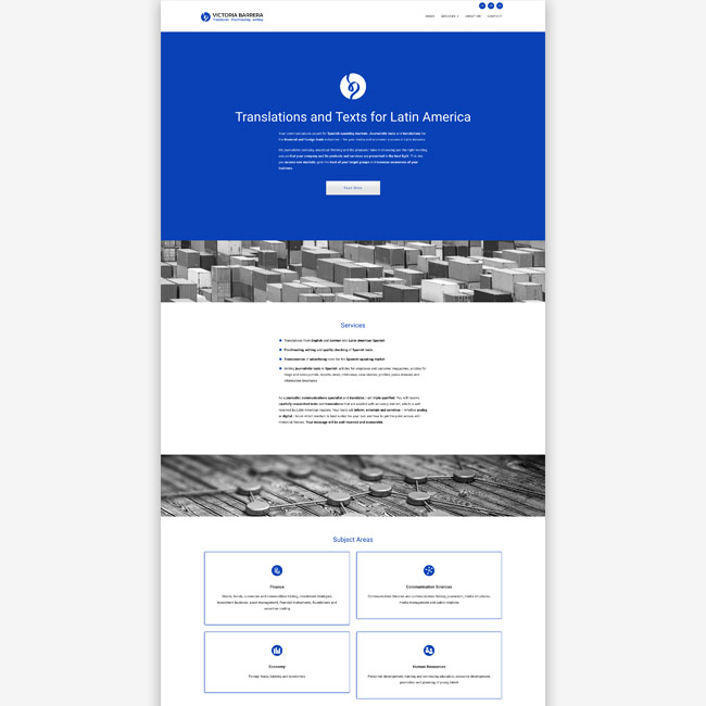
Next came the figurative mark, which with translators and interpreters is always a challenge not to get too figuratively. I settled on an elegant band in a b-shape for Barrera. Not overly creative, but here it just works—coincidentally, set on a bright blue dot the b-shape looks like the South American continent! This may indeed be the first logo I developed for a translator (and I have designed quite a few of them), that you can interpret as a globe. I swear it was an accident 😉
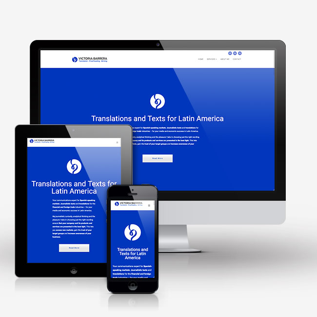
The website is a relatively simple, but with it’s bright blue color choice pretty bold, one page layout. A few black-and-white images with trade, finance and communication motifs mark the different sections and help calm the attention craving color, and lastly, a few sparingly used text animations bring in a little character and responsive feel.
As always, I had help with programming from Stagenet (who just launched a brand new homepage themselves, by the way!)
2018/2019